Rothy’s Branding 2019
strategy // Identity System // Photography Art Direction // Brand System Guidelines // DIGITAL REFRESH OF WEBSITE + SOCIAL + ADS + PRINT
the first ever branding initiative for rothy’s + we also created a DIGITAL REFRESH OF THE WEBSITE + SOCIAL + ADS + A spring / summer 2019 mini magazine, post branding initiative. the strategy was to ELEVATE, STREAMLINE, acquire new customers, push fashion credibility / brand awareness and test acquisition AND SHOWCASE THE sustainability STORY PROPERLY FOR THE FIRST TIME EVER.
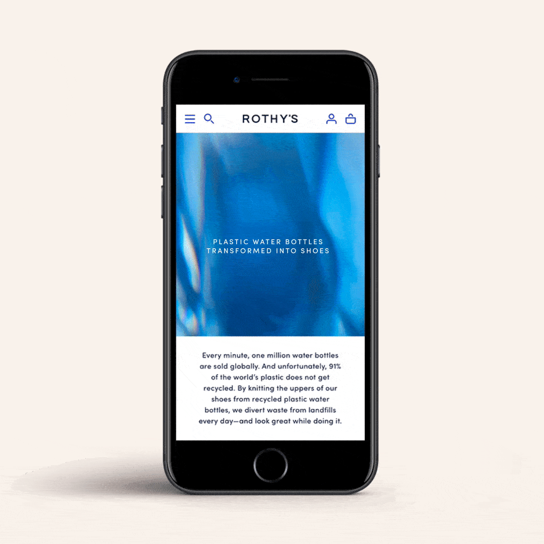
Rothy’s is a sustainable footwear brand that has transformed over 40,000,000 plastic water bottles into shoes since the brand’s inception. the goal was to re-think the brand's strategic positioning and visual identity in order to tell a story that goes beyond what they make to why they make it.
defining the brands ethos, strategy, overarching brand concept, visual language, brand guidelines, and photography art direction. Inspired by the idea of a workshop, the visual identity speaks to the way today’s women drive Rothy’s to create and iterate, constantly inspiring the creative process and in turn, taking inspiration from what comes out.
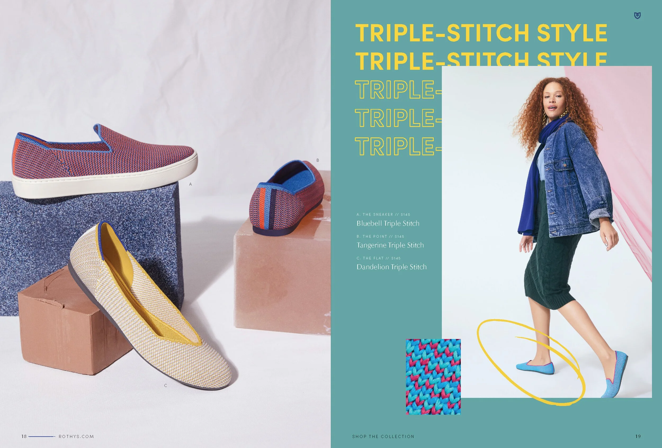
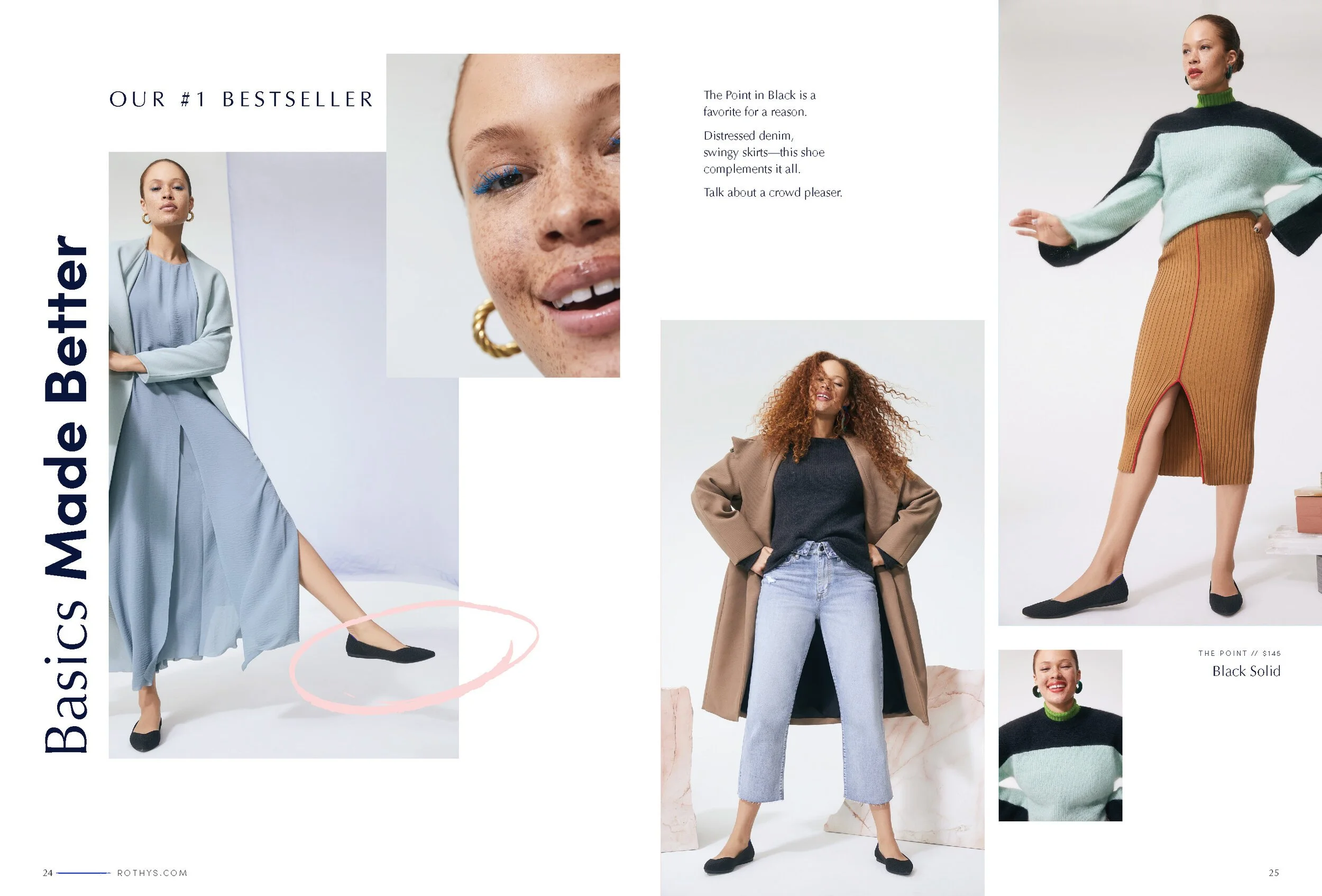
photographer: olivia malone . styling: rachel gilman . makeup: karo kangas


Digital Refresh
mobile // desktop - https://rothys.com/
The Challenge - Rothy’s is a leader in sustainable fashion. They needed to make sure there was one spot for their consumers to understand the sustainability story.
Goal - The overall goal for this page was to inform and educate the user. The business wanted to redesign the sustainability page in a way that gave them the opportunity to tell a story of the process of how their product comes to life and everything that intertwines with that process. The page needed to be flexible.

Prior Sustainability Page Design
The design previously had a toggle menu for users to flip through specific parts of the Rothy’s sustainability story But the business wanted to showcase that these elements all intertwine together and should be on one page.
THIS sustainability page IS an important aspect to the brand and digital experience, the GOAL WAS to make this a priority page, OVERHAUL out of date fonts, colors, and photography.
Final Designs