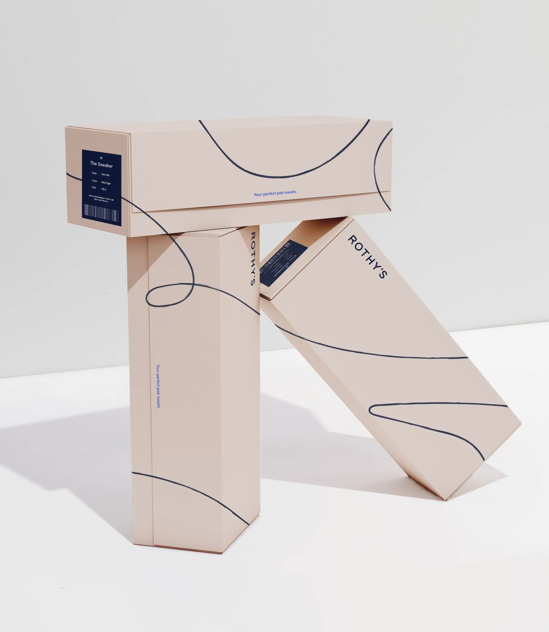
Rothy’s Branding 2019
* Rothy’s Branding 2019
Rothy’s Branding 2019 * Rothy’s Branding 2019

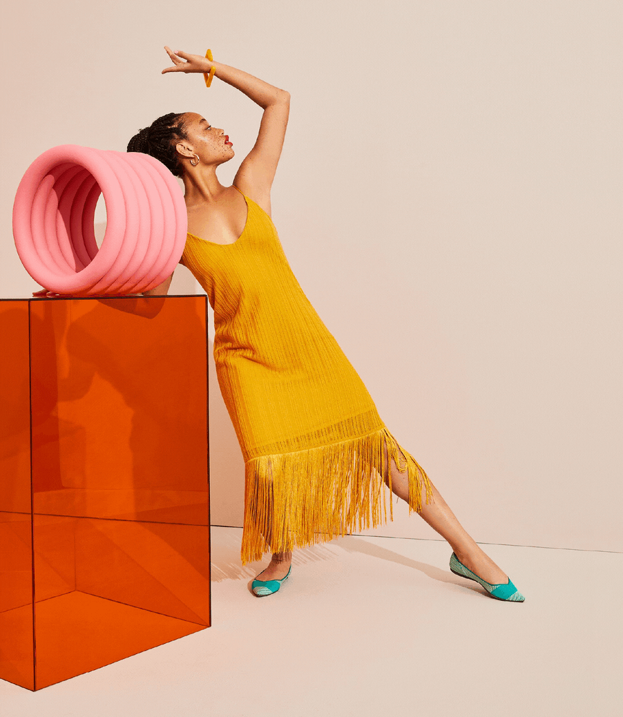
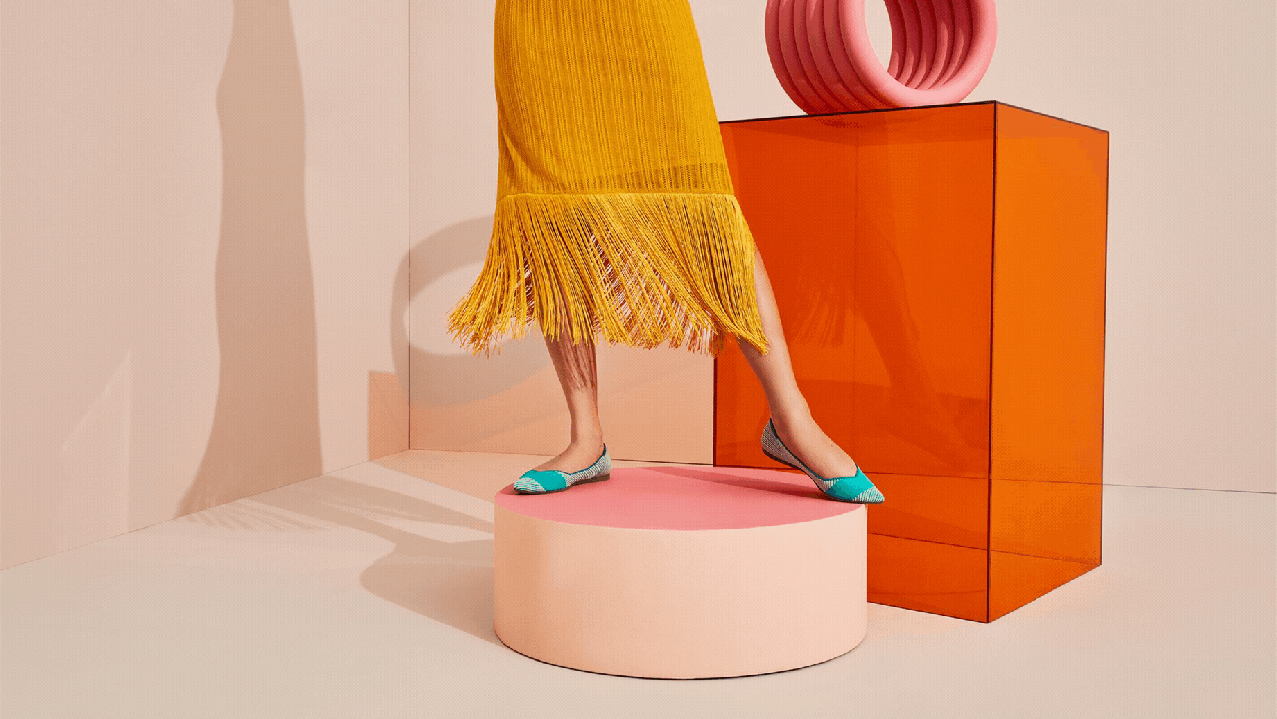
shoot team
photographers: a mix of kat borchart + olivia malone
styling: rachel gilman + makeup: karo kangas
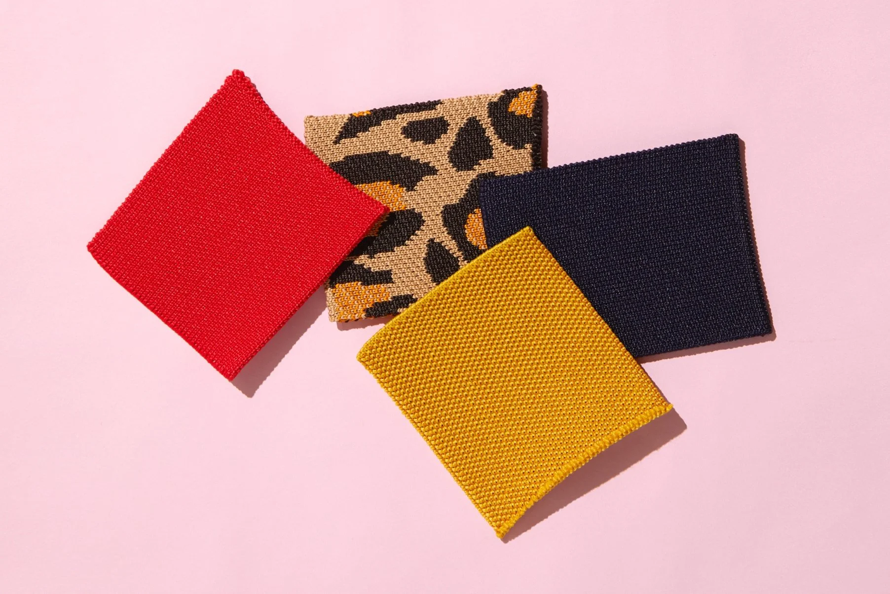
creative director at rothy’s — i led the first rebrand iniiative which included — Brand Guidelines + an omni-channel brand refresh
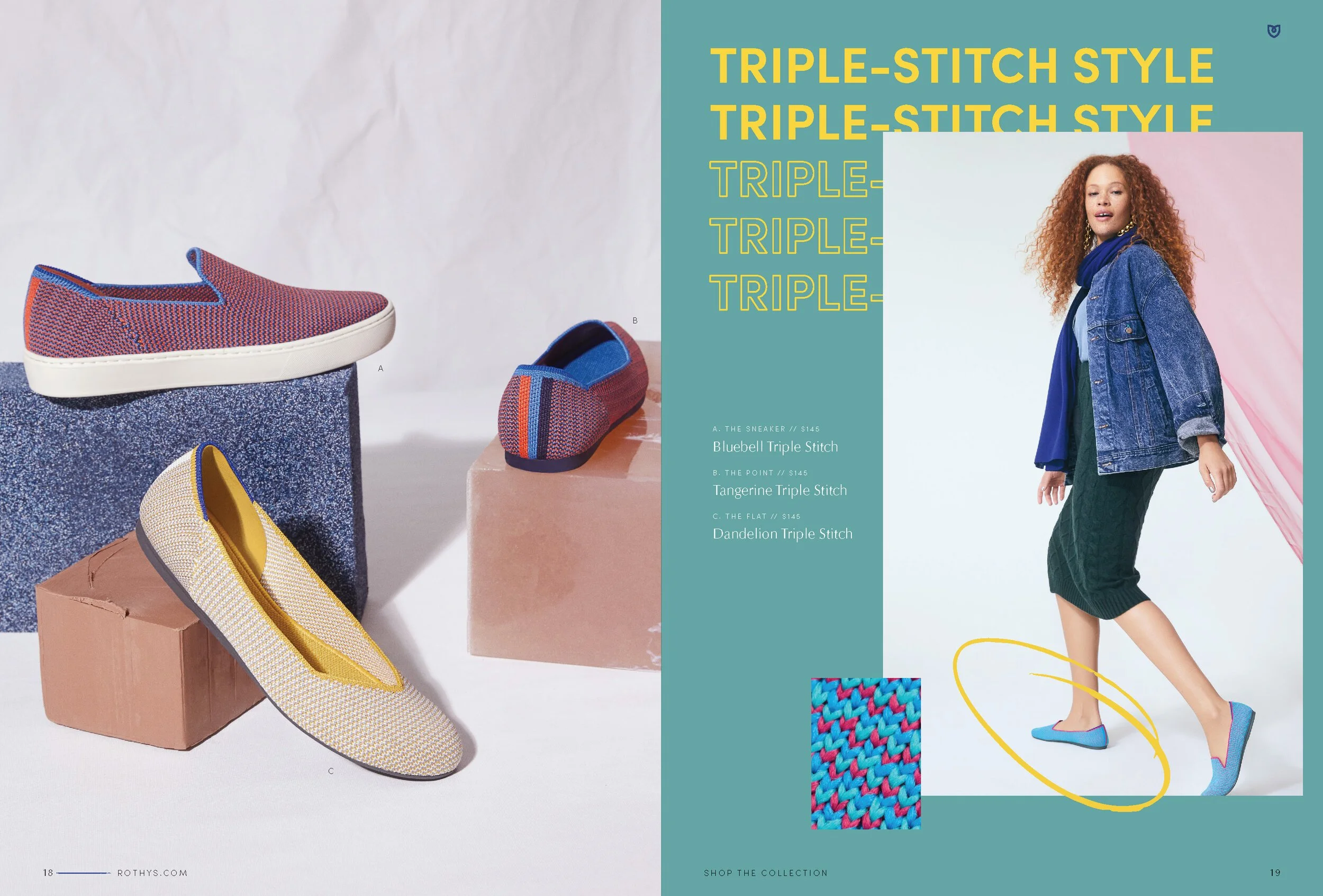
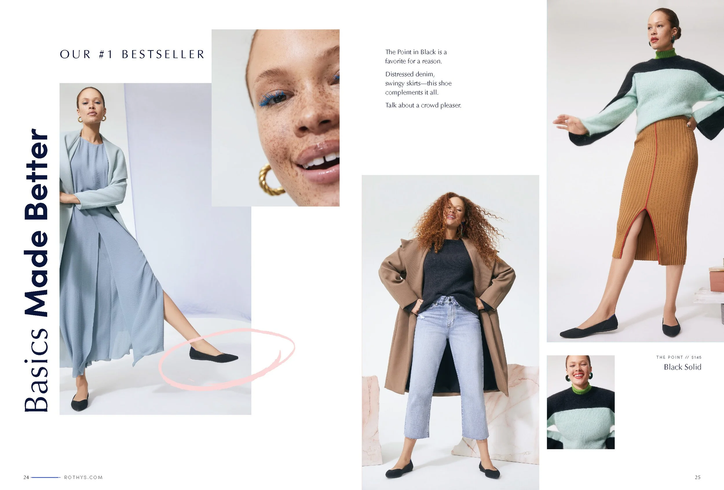
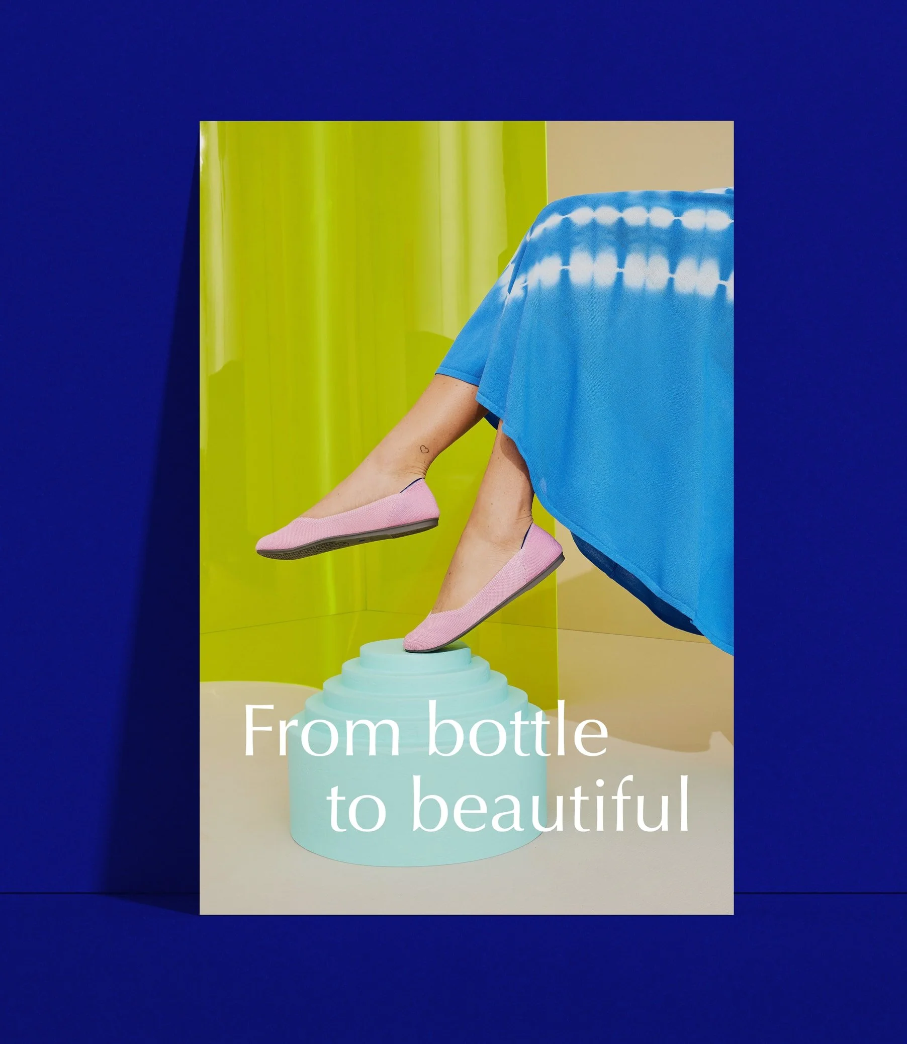
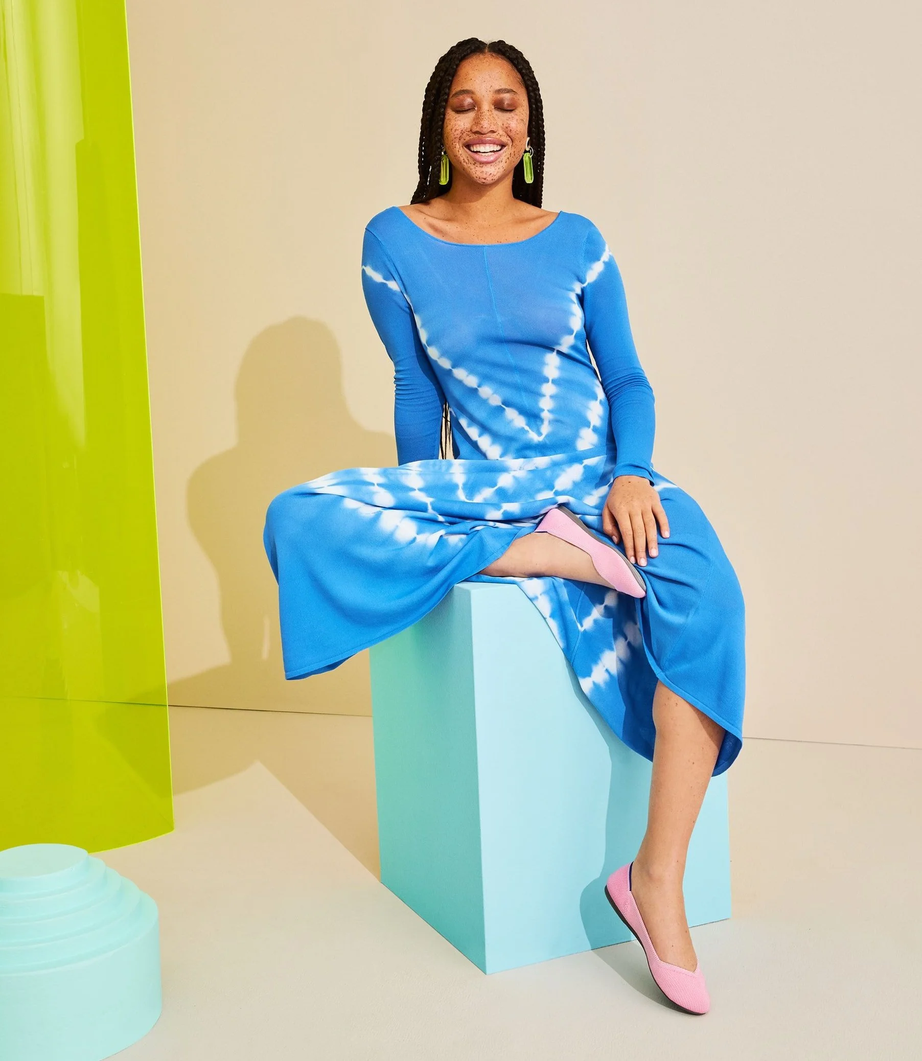
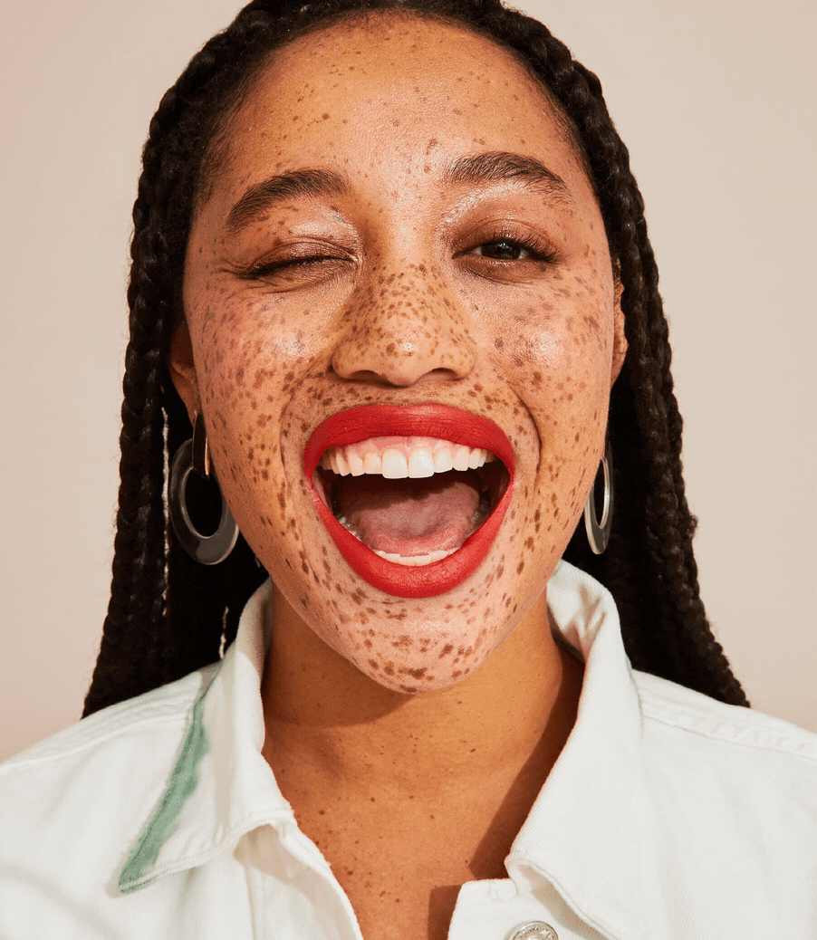
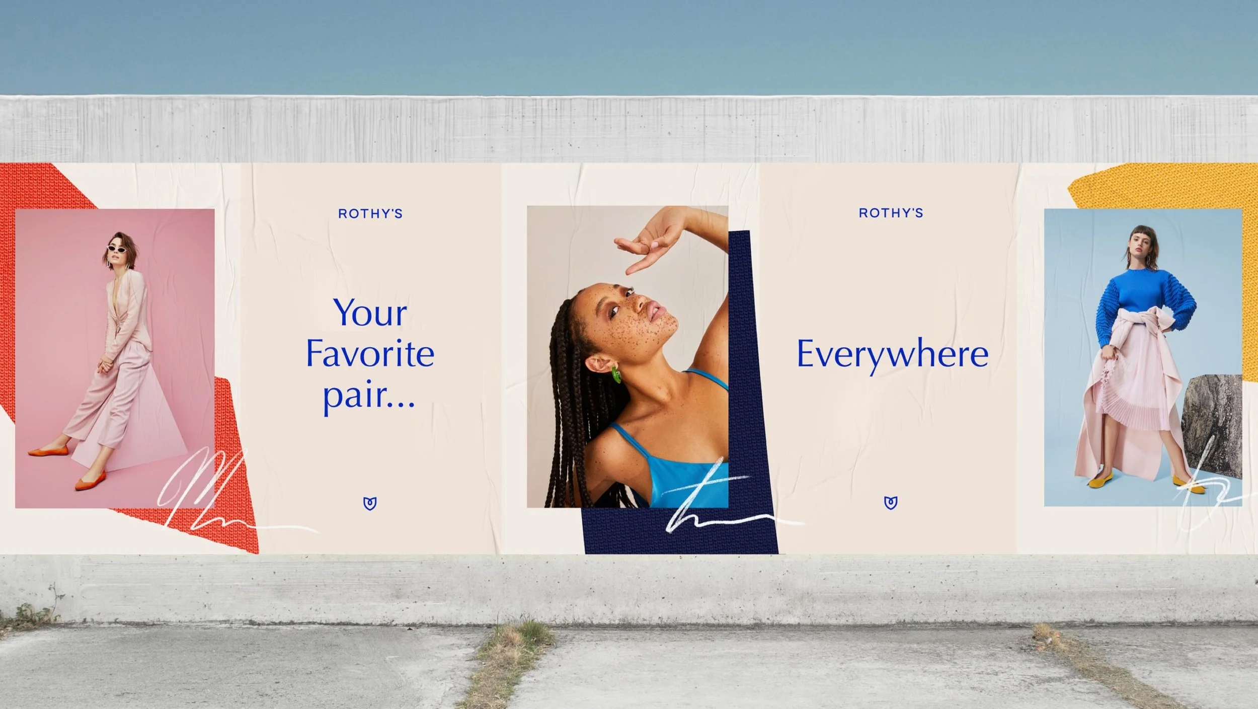
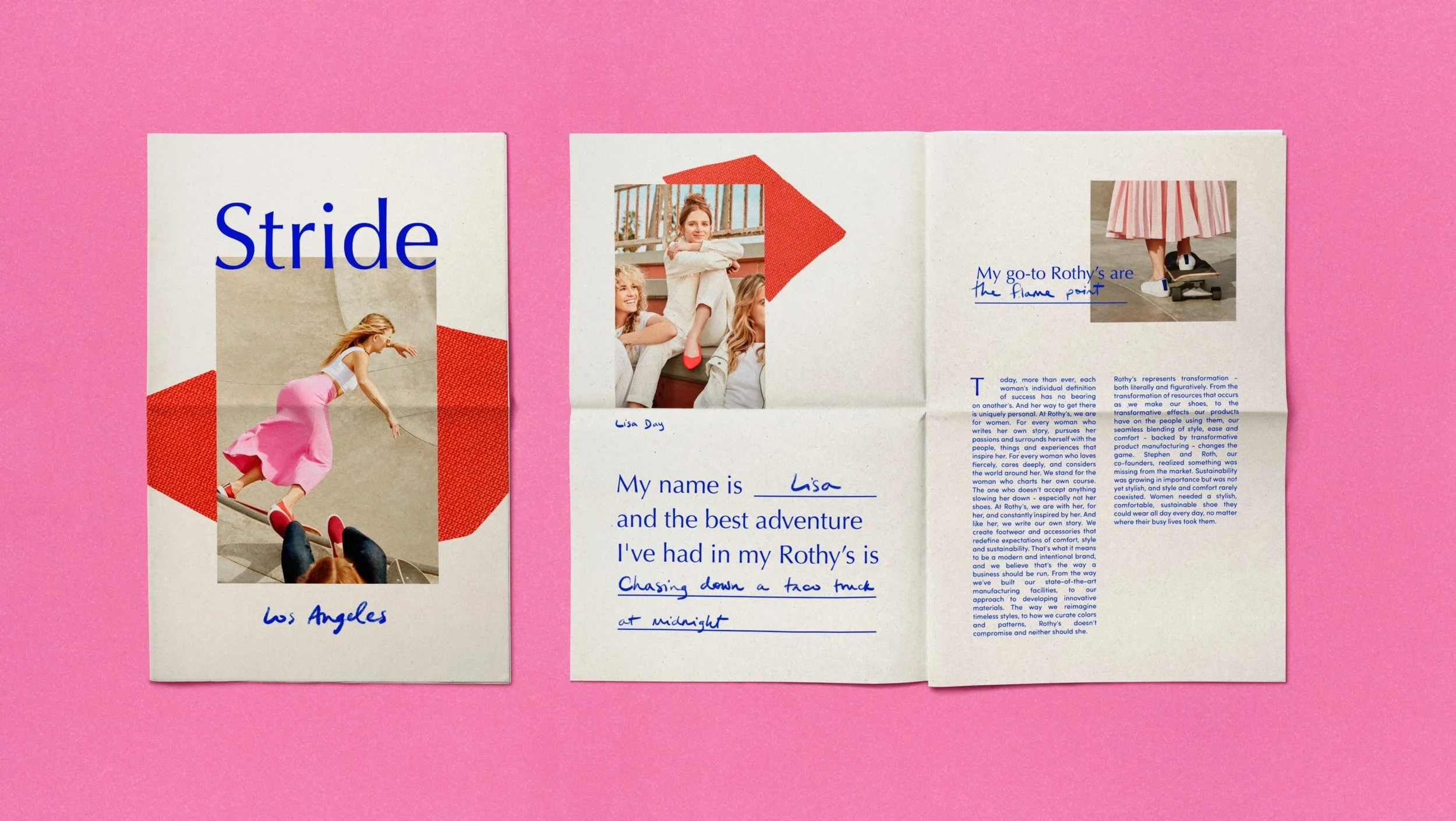
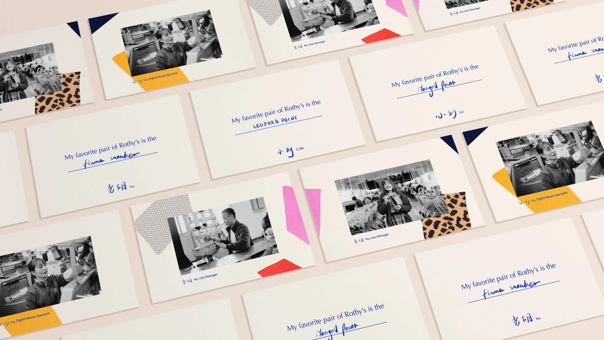
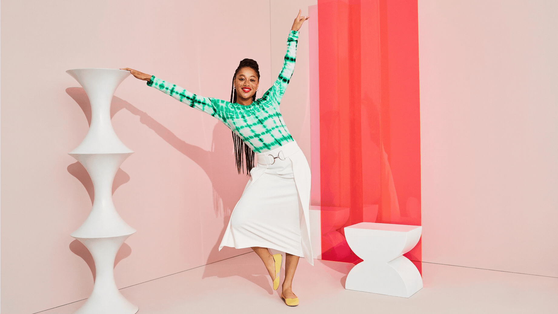
Rothy’s made its name with shoes spun from recycled plastic bottles, quickly attracting a loyal following of environmentally conscious women (primarily Gen X and older Millennials) who valued both comfort and sustainability. With that foundation in place, the brand set its sights on the next level of growth—expanding its appeal to a younger, more style-conscious generation while honoring the sustainability values and early supporters that sparked its rise.
I led a complete rebrand that touched every aspect of the business, from positioning and voice to a refreshed visual identity and new photography direction. The goal: evolve Rothy’s into a more fashion-forward brand, with sustainability and style as key differentiators.
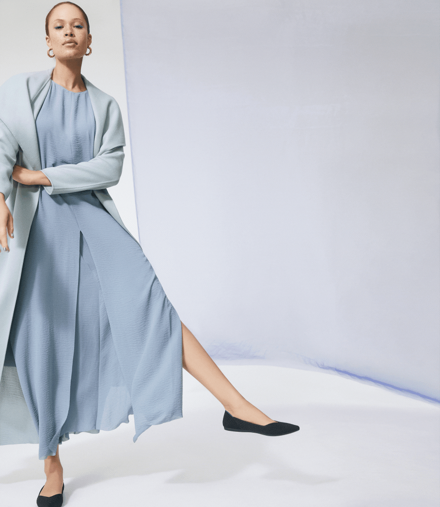
The results speak for themselves: since launch, Rothy’s annual revenue has nearly doubled, and the brand has grown from a single San Francisco shop to more than 25 stores nationwide.
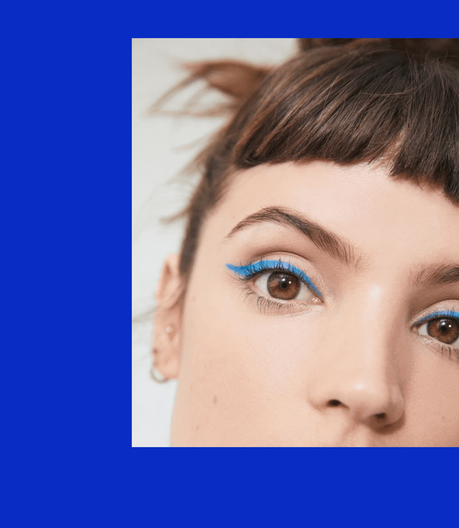
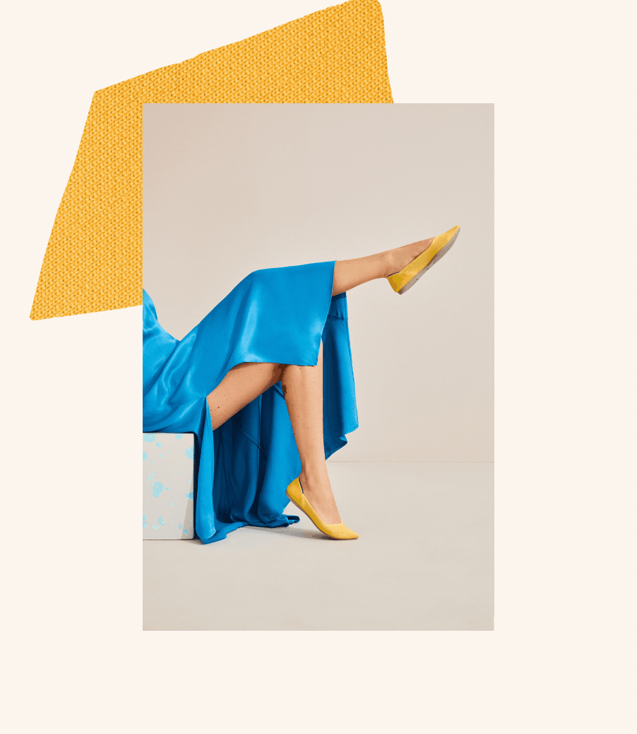
photographer: olivia malone
styling: rachel gilman + makeup: karo kangas
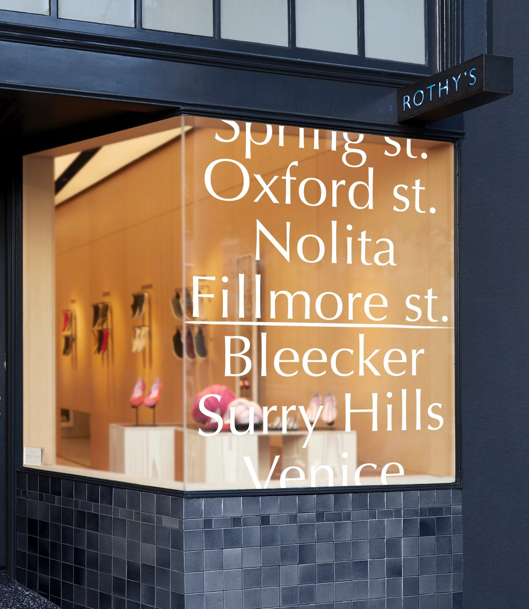
From cult classic to modern mainstay


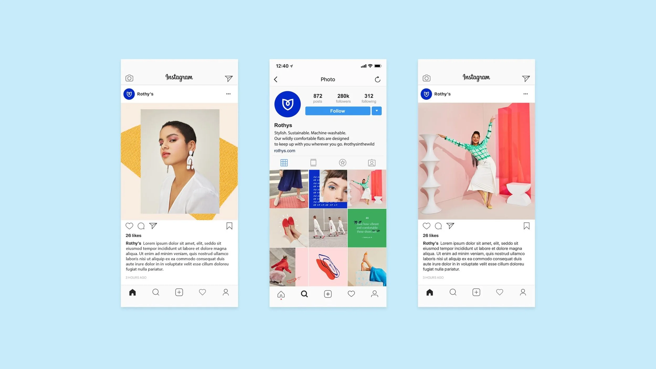

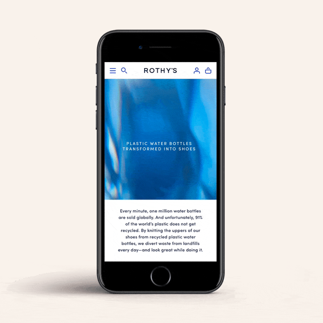
mobile // desktop - https://rothys.com/
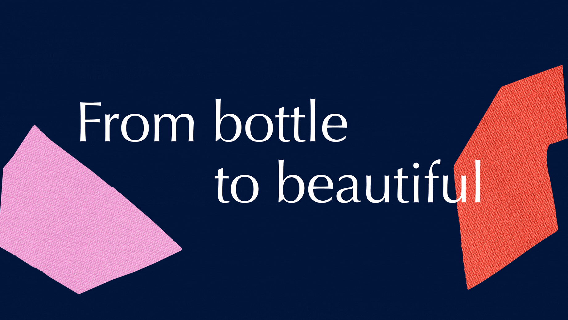
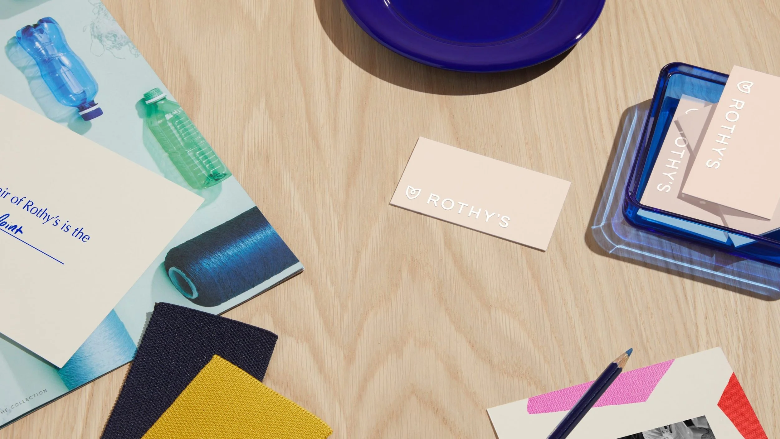
The Challenge - Rothy’s is a leader in sustainable fashion. They needed to make sure there was one spot for their consumers to understand the sustainability story.
Goal - The overall goal for this page was to inform and educate the user. The business wanted to redesign the sustainability page in a way that gave them the opportunity to tell a story of the process of how their product comes to life and everything that intertwines with that process. The page needed to be flexible.
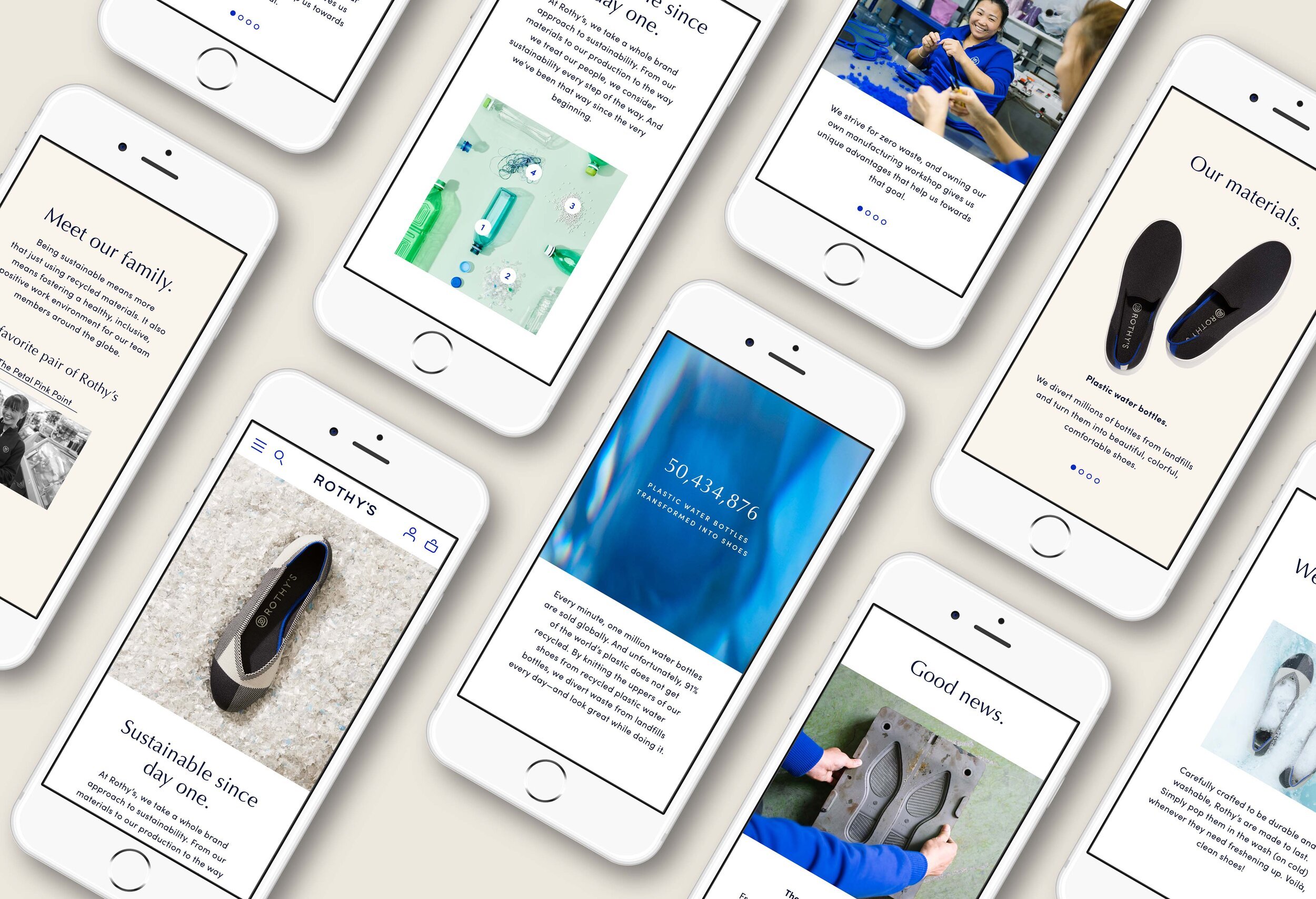
Digital Refresh
The design previously had a toggle menu for users to flip through specific parts of the Rothy’s sustainability story But the business wanted to showcase that these elements all intertwine together and should be on one page.
THIS sustainability page IS an important aspect to the brand and digital experience, the GOAL WAS to make this a priority page, OVERHAUL out of date fonts, colors, and photography.

old Sustainability Design


Final Designs